Graphical User Interface
IGE includes is a set of tools for developing user interfaces for games and applications.
Canvas
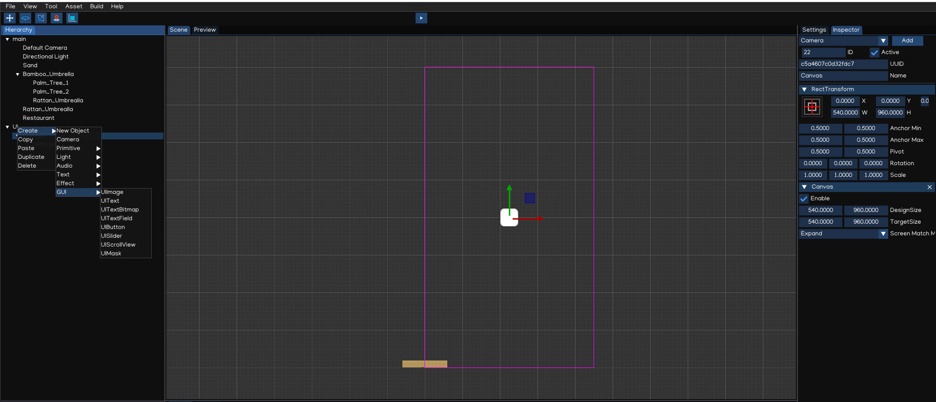
The Canvas is a game object with a Canvas component on it. All UI elements must be children of a Canvas.
Creating a new UI element, such as an UIImage using the menu Create > GUI > UIImage, automatically creates a Canvas, if there isn’t already a Canvas in the scene.
Tip
To work with GUI, switch the Scene Camera to 2D mode. The Canvas will be displayed as a rectangle in the view, it help to easier posioning the UI elements on the scene.
The Canvas component can be setting up using Inspector.
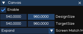
Property |
Function |
|---|---|
DesignSize |
Canvas design screen size |
TargetSize |
Target screen size (Editor only) |
ScreenMatchMode |
|
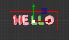
RectTransform
The RectTransform is a new transform component that is used for all UI elements.
It has position, rotation, and scale just like regular Transforms, but it also has a width and height, used to specify the dimensions of the rectangle.
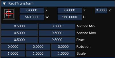
Property |
Function |
|---|---|
X, Y, Z |
Position X, Y, Z |
W, H |
Width and Height |
AnchorMin |
Lower left anchor handle |
AnchorMax |
Upper right anchor handle |
Pivot |
Pivot position |
Rotation |
Rotation value |
Scale |
Scale value |
Tip
Use Z position to adjust the drawing order of elements, and may also help to resolve Z-fighting issues.
Pivot
Rotations, size, and scale modifications occur around the pivot so the position of the pivot affects the outcome of a rotation, resizing, or scaling.
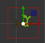
Anchors
A child RectTransform can be anchored to the parent RectTransform in various ways:
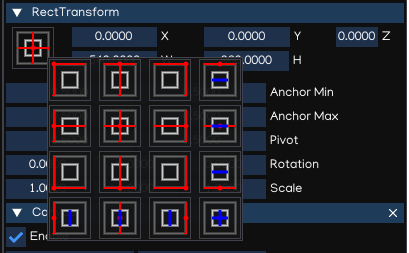
Tip
The blue arrow indicates that the child will stretch together with parent size, in horizontal, vertical or both accordingly.
UI Components
With the introduction of the UI system, new Components have been added that will help you create GUI specific functionality.
UIImage
The UIImage component is used to display an image on screen.
The Inspector window allows to change the image settings:
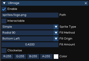
Property |
Function |
|---|---|
Path |
The path to the image file |
Inteactable |
Ability to receive events using Script |
Sprite Type |
The Sprite type, can be:
|
Fill Method |
Allow to fill just part of an image by:
|
Fill Origin |
Fill origin, can be:
|
Fill Amount |
Amount of filling, from 0.0 to 1.0. |
Clockwise |
Fill direction, clockwise or counter-clockwise |
Color |
Diffuse color |
UIMask
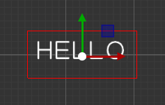
An UIMask is not a visible UI control but rather a way to modify the appearance of a control’s child elements.
The mask restricts the child elements to the shape of the parent.
So, if the child is larger than the parent then only the part of the child that fits within the parent will be visible.
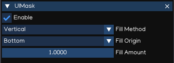
Property |
Function |
|---|---|
Enable |
Enable/disable mask |
Fill Method |
Allow to fill just part of an image by:
|
Fill Origin |
Fill origin, can be:
|
Fill Amount |
Amount of filling, from 0.0 to 1.0. |
Clockwise |
Fill direction, clockwise or counter-clockwise |
UIText
The UIText component has a Text area for entering the text that will be displayed.
It is possible to set the font, font style and font size, and alignment of the text using Inspector.
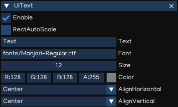
Property |
Function |
|---|---|
RectAutoScale |
Auto resize the Rect Transform with text size |
Text |
The text to display |
Font |
The font to display (.ttf, .otf, .pybm) |
Size |
The font size |
Color |
Text color |
AlignHorizontal |
Horizontal alignment |
AlignVertical |
Vertical alignment |
The UIText support drawing text using true-type font (.ttf, .otf) and bitmap font (.pybm) formats.
Bitmap Font Creator can be used to create bitmap font, which can be found at Menu -> Tool -> Bitmap Font Creator.
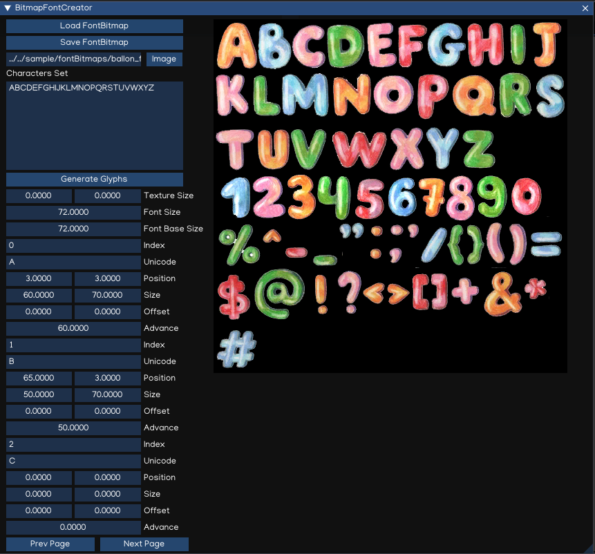
Property |
Function |
|---|---|
Load FontBitmap |
Load the saved bitmap font |
Save FontBitmap |
Save the bitmap font |
Image |
Path to the image file (.pyxi) |
Characters Set |
Characters set to be generated |
Generate Glyphs |
Generate/reset glyphs for input characters set |
Texture Size |
The image size |
Font Size |
The font size |
Font Base Size |
The font base size |
Index |
Glyph index |
Unicode |
Character in Unicode format |
Position |
Top-left position of the character in the image |
Size |
Size of the character |
Offset |
Character offset |
Advance |
Character advance width |
To create new bitmap font, flows steps below:
Accquire bitmap texture file which contains all the characters, copy it to
fontsfolder.Open
Bitmap Font Creator, select the image file.Input all the characters that is supported in
Characters Settextbox.Generate glyphs by pressing
Generate Glyphsbutton.For each glyphs, input the position, size, offset and advance value.
Save the font by pressing
Save FontBitmapbutton.Test the font by create
UITextcomponent, then drag and drop the newly created font in theInspectorwindow.
Note
Bitmap font only displayed as RGB texture if background use alpha channel. Otherwise, it will render as grayscale color to resolve alpha issue.
Tip
Saved Bitmap fonts can be modified with new characters set. Just need to add more character in the Characters Set textbox, then press Generate Glyphs, it will create new glyphs without affects existing glyphs.
Tip
Better to use an image editor (such as Paint.NET(R), MS Paint(R), Adobe(R) Photoshop(R)) to mesure the character attributes to put in the glyphs parameters.
UITextField
UITextField is used to display an editable text box to the user.
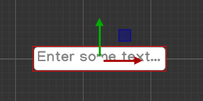
The usage of this component is similar to UIText, except it allows text to be input by user.
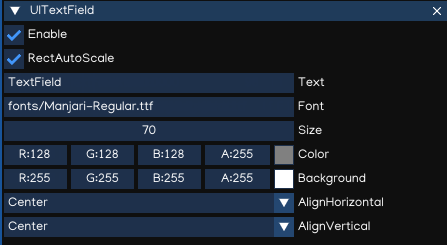
Property |
Function |
|---|---|
RectAutoScale |
Auto resize the Rect Transform with text size |
Text |
The text to display |
Font |
The font to display (.ttf, .otf, .pybm) |
Size |
The font size |
Color |
Text color |
Background |
Text background color |
AlignHorizontal |
Horizontal alignment |
AlignVertical |
Vertical alignment |
To handle the input ended event, add this code to Script:
from igeScene import Script

class TxtUserName(Script):
   def __init__(self, owner):
      super().__init__(owner)
      # Read the value from UITextField
      self.username = owner.getComponent("UITextField").text
      print(f"Welcome {self.username}!")

   # Invoked at input ended
   def onValueChanged(self, val):
      self.username = val
      print(f"Welcome back {self.username}!")
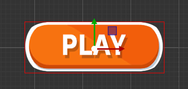
UIButton
The UIButton component implement a button in GUI, which responds to a click from the user and is used to initiate or confirm an action.
The Inspector properties are as below:
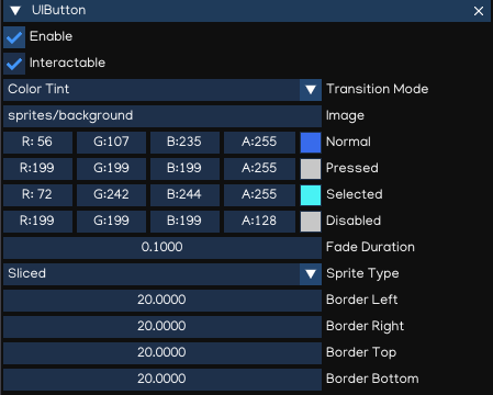
Property |
Function |
|---|---|
Inteactable |
Ability to receive events using Script |
Transition Mode |
The transition between button states:
|
Image |
Background image |
Normal |
Color/sprite of the Normal state |
Pressed |
Color/sprite of the Pressed state |
Selected |
Color/sprite of the Selected state |
Disabled |
Color/sprite of the Disabled state |
Fade Duration |
Transition Duration |
Color |
Diffuse color |
Sprite Type |
The Sprite type, can be:
|
Border Left |
Border left percentage |
Border Right |
Border right percentage |
Border Top |
Border top percentage |
Border Bottom |
Border bottom percentage |
The action can be controlled using Script, which onClick callback like below:
from igeScene import Script

class BtnNoAds(Script):
   def __init__(self, owner):
      super().__init__(owner)

   def onClick(self):
      print("NoAds Button Clicked, process purchasing...")
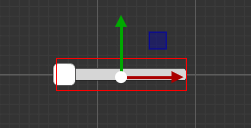
UISlider
The UISlider allows user to select a numeric value from a range by dragging the mouse.
The Inspector properties are as below:
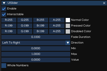
Property |
Function |
|---|---|
Inteactable |
Ability to receive events using Script |
Normal |
Color of the Normal state |
Pressed |
Color of the Pressed state |
Disabled |
Color of the Disabled state |
Fade Duration |
Transition Duration |
Direction |
Slider direction
|
Min |
Min value |
Max |
Max value |
Value |
Current value |
Whole Numbers |
Constrained value to integer number when checked |
To handle value changed event, add this code to Script:
from igeScene import Script

class VolumeSlider(Script):
   def __init__(self, owner):
      super().__init__(owner)

   def onValueChanged(self, val):
      self.volume = val
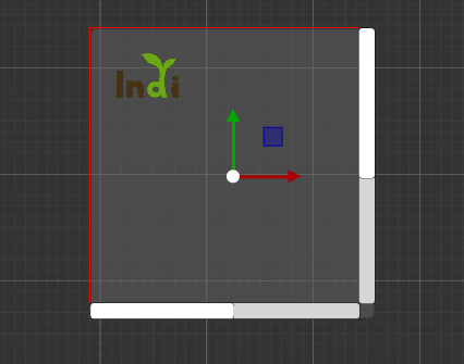
UIScrollView
An UIScrollView can be used to scroll the content that takes up a lot of space and needs to be displayed in a small area.
It is usually combined with an UIMask in order to create a scroll view, and with one or two UIScrollBar that can be dragged to scroll horizontally or vertically.
The Inspector properties are as below:
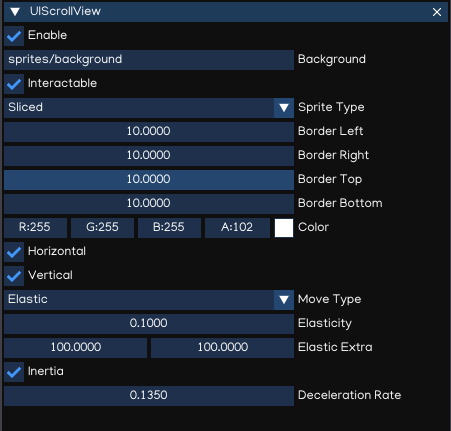
Property |
Function |
|---|---|
Inteactable |
Ability to receive events using Script |
Background |
Background image |
Sprite Type |
Sprite type, either Simple or Sliced |
Color |
Diffuse color |
Horizontal |
Enable/disable horizontal scrollbar reference |
Vertical |
Enable/disable vertical scrollbar reference |
Move Type |
Movement type, either Claimed or Elastic |
Elasticity |
The amount of bounce used in the elasticity mode |
Elastic Extra |
The extra boundary allowed in Elastic mode. |
Inertia |
Allow content to move after pointer releasing |
Deceleration Rate |
Determines how quickly the contents stop moving |
To support UIScrollView implement, the UIScrollBar is introduced to allow the user to scroll the view using drag handler.
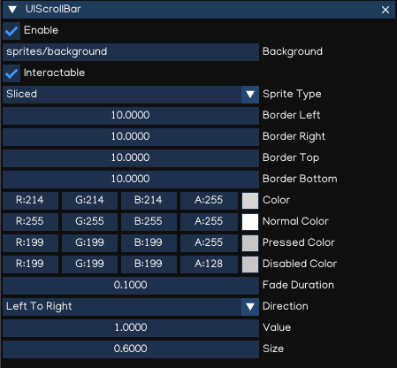
Property |
Function |
|---|---|
Inteactable |
Ability to receive events using Script |
Background |
Background image |
Sprite Type |
Sprite type, either Simple or Sliced |
Color |
Diffuse color |
Normal Color |
Color of the handler in normal state |
Pressed Color |
Color of the handler in dragging state |
Disabled Color |
Color of the handler in disabled state |
Fade Duration |
Fading duration, in second |
Direction |
Dragging direction
|
Value |
Current value |
Size |
Handler size |
To handle value changed event, add this code to Script:
from igeScene import Script

class HScrollBar(Script):
   def __init__(self, owner):
      super().__init__(owner)

   def onValueChanged(self, val):
      self.position = val